Showing posts with label tyler. Show all posts

Making 10.10 a perfect 10/10 - Evolution

View Comments
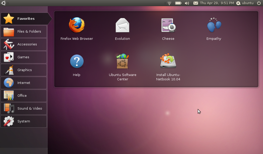
With the default apps chosen and announced for 10.10, Maverick Meerkat, I decided that I wanted to take a look at a few apps in particular and look at some of their strengths and weaknesses, and what I hope happens in the next couple months to make 10.10 a perfect ten out of ten. I will really focus on those apps here on OMG!, although, (at a slower, more thorough pace) I will also be looking at those applications on my own personal Ubuntu blog, such as a post on Tomboy and GTG from a few days ago.

First up on the chopping block? Evolution.

A long history of hate


I'm not a fan of email clients, and I never have been. In an age where I can get on the internet just about anywhere, and most of my computer interaction is online, it just seems cumbersome to jump through hoops to get to my email. The first time I installed Ubuntu almost 2 years ago, I decided I ought to give Evolution a try, being as, hey! It was there, and if its in Ubuntu its got to be awesome, right?

Well, I was wrong. After sweating and fighting the software for days, I gave up trying to access my Hotmail and Gmail accounts. Apparently, at the time, these were both impossible unless you sold your soul to the horrors of port forwarding or some nonsense that my noob computer mind couldn't understand.

Syncing


However, in more recent times, Evolution has smoothed out some of these compatibility issues. But this is still, by far, the most important feature to be worked on in Evolution. Better syncing across Gmail, Google Calender, Hotmail, tasks in GTG!, notes in Tomboy, contact syncing all need serious work to even catch up, much less make it a pleasant experience. I currently only use evolution at all to give me an offline backup of Hotmail and Gmail, just because there isn't a better way right now.

First of all, syncing with both Gmail and Hotmail both need work. There are some interesting studies done showing market share of how people access their email (@fingerprintapp) and other tests showing over shares of @ addresses. Hotmail/Live addresses are still huge, Yahoo is still huge, and Gmail is growing very quickly. Yet Yahoo is the only one of these three that syncs well. On a near daily basis (and sometimes more than once a day) my Hotmail account in Evolution decides to download hundreds of messages and mark them as new... even when they are months old and marked as read in Hotmail. That sucks.

Furthermore, are we really still stuck in the age of setting 'minutes between check' stage? Lets get some push integration, for crimany's sake.

Speed


Evolution is SLOW. Super slow. It sits and scans and I have no idea what its doing, I just know if I try to rush it, it crashes. I don't know what its up to, I can't figure it out. Its just slow, and sits there and cranks away at nothing. Lets please get faster, I don't care why. Theres no reason to use an email client that is far far slower than just going to the website.

Accessibility and the Messenging Menu


I really like the Messenging Menu. Its not perfect yet, but its pretty cool. But for 10.10, I'd really like to see Evolution find a way of integrating with the Messenging Menu so that it can check for new messages (again, with push!) without needing to be totally open. I don't need my full calender, memos, task (which, I use none of that, because its slow and not compatible well) just to sit there and tell me when I have new messages. It would be great to not have to use a seperate program (Gmail Notifier) to tell me when I have new messages while their still new, and then have a new notification, several minutes late from Evolution, about the message that has already been read. Awesome.

Furthermore, it would really truly be fantastic if there was integration with Gwibber and Empathy, so that my contacts in one could be grabbed in the other.

Memory Use


Related to speed is just the huge gargantuan size of Evolution. You know what I'd love? If there was better syncing with Gmail, Hotmail, and Yahoo, then it could direct pull my contacts and I wouldn't need a whole contacts app built in. I don't need a whole calender app to load to check my email. I don't need the to-do or memos either. If I don't need those other apps, then why should I have them bogging down my email app? Please, let me just use a email app if I just want an email app.


Truthfully, I don't want a huge monolithic email client, I want a program to tell me when I have new email, right when I get it, not 12 minutes later. I want it quick and stable. I want offline access that works, so that things are more convenient, not obnoxious. But those who want the notes and calender deserve those to be stable and usable as well.


My Disclaimer:

Thank you for Evolution, developers. But lets hop on top of things. Announce some future plans, open up some discussion, tell us where you need help. I can't even figure out who's working on it or how to tell you my ideas, so I hope somebody who reads this knows who to tell, but theirs plenty of us who want a native GTK email client that works for us, instead of against us. I'd rather use a slim, fast, native app than something marginally better with its own peculiarities.
Continue reading

Tyler on Ubuntu: Why Netbooks are bringing the future

View Comments

In case you've  been hiding under a rock, or hang around people who exclusively use Mac hardware, then you've witnessed the explosion of the Netbook. Small, light, less then 10 inches, and with impressive levels of battery life, netbooks have gone from toy to everywhere in 2 years, and have now settled into an area somewhere between secondary computer and primary net device for many people. They're cheap, they're portable, they can very nearly be given as gifts and many schools, such as my own, have handed them out like candy.

The real trick, though, was to get the perfect balance of hardware and software so that they actually mattered. To get something so small with enough battery to make them worthwhile, you really have to hit a home run with the software. Many of the first generation, and  some of the more clueless manufacturers still do this, simply shipped windows on the netbook, so what you get is a very slow, really small windows laptop. Even still, people have estimated 90% of netbooks still use XP. However, it is estimated that 32% of laptops shipped since November 2009 run customized Linux of some form, and Ubuntu Netbook Edition is one of the most used OS's available (Yes, those statistics are from Wikipedia).

UNE has already made great strides. Working off the model Moblin established in '07, UNE has been consistently doing something that has stagnated on the common Ubuntu desktop: Innovate. Something about the combination of the cheap computer, small screen, and tiny trackpad has given people the ability to release control of their desktop just enough for a complete change to take place, a change which has been steadily pushing its way to the common mix of Ubuntu over the last 2 years. Much of Ayatana's work has been under the label of 'Saving vertical screen space for netbook users' and much of what we will continue to see will fall under this header.


Unity


And we've seen it happen yet again. Mark Shuttleworth's announcement of the new "Unity" interface for UNE has shown something we should have noticed for months now. Ubuntu is working on the interface for Netbooks far more then for non-Netbooks. Partly, this is just the nature of the netbook. Anything done to improve the standard desktop will float downstream to the netbook interface eventually, but its more then that. The netbook is the testing ground, the place for new things to happen. The newness of the device means the newness of possibilities, and if I got one message from Mark's address, it was "Lets conquer this device." How many of the last few Ubuntu announcements been entirely Netbook oriented? Since Mark announced Maverick Meerkat, every announcement has either been entirely or at least half and half Netbook oriented. Its clear that this is important to them, and I think it should be made clear to Ubuntu users that this is the direction we are moving in: fast, User-data oriented, and internet focused.

Not only that, but the new Network Connections menu is UNE only, the recently announced global menu is UNE only, their new launcher... the new things are UNE oriented, almost in entirety, and the only love for the common desktop is the overlap between the two.


What does that mean for 10.10?


Well, first of all, I think theres something extremely telling although not mentioned directly in Marks announcement. In the Official screenshots, Firefox is still the browser, but in Mark's personal screenshots, we see Chromium. Don't be surprised to see Chromium become official sometime in the next year and a half, at least for the Netbook edition. Now, I didn't say expect it, I said don't be surprised. Don't misquote me. :D

Secondly, don't expect gnome-shell to find a permanent home any time soon. Unity has apparently been worked on for longer then gnome-shell, as Mark said on his blog. Why is this important? It means that Ubuntu has their own panel and their own launcher, which may well be based in gnome, but could very easily be brought up to snuff as a whole before development for current Gnome ceases. While gnome-shell will be apparently packaged as an option in Ubuntu, I think its more likely that we'll see a slightly altered version of the netbook panel and launcher far more likely.

Third, expect more of this. If you hate the me-menu, and the announcement today about Unity, and you demand more bug fixes instead of new menus... you're going to be disappointed. Theres going to just continue to be more announcements of new panels  and new indicators and new this and new that. I personally get excited, but I know some of you guys hate it. Sorry.

Lastly, lets hear the (constructive) feedback. If you ask me, Ubuntu has become the best desktop experience available, and the only thing that Ubuntu lacks compared to Mac and PC is professional use applications and some usability. This Netbook stuff is the foundation for pure perfect beautiful usability on the Ubuntu desktop, and you, the user, needs to speak up about the things you want. Theres plenty of stuff that I spend my time criticizing, but its by analyzing what is good and what is bad that leads to improvement. Lets speak up, and make 10.10 the best operating system it can be.

Share your thoughts on the new Netbook announcements in the comments!

Continue reading

Tyler on Ubuntu: Nautilus

View Comments
With the release of Nautilus-Elementary 2.30 I've been thinking quite a bit about File Browsers. I did a comparison of the 4 file browsers I see the most often, (Finder, Nautilus, Explorer, and Nautilus-Elementary), but now I'd like to focus a bit more on just Nautilus and Nautilus-Elementary.
Honestly, I'm rather impressed by the overall available functionality contained within Nautilus: Tabbed browsing, Spatial views, tree/list views, as well as many different other possible options available within a vanilla install of Nautilus. Once you tweak Nautilus up, its far easier to get to files and information in Ubuntu than in Windows or OS X.
But are we trained for failure when it comes to file browsing?

Nautilus in review

More than just in terms of GUI and looks, I would think that the very basic paradigm of file browsing is less than usable.
Lets look at a couple screenshots:
image
Here’s an example of a basically vanilla install of Nautilus. Now, it could be easy to tear apart the basic grossness of what’s happening here (I circled in red all of the primary controls, and in case you didn't notice, their ridiculously off-balanced and crammed together) but rather than look at just where the buttons are, I want to look at how we actually use this thing.
So here we are in the Home Folder. Which is a folder just like any other folder. So, why is it even a folder? I mean, in this screen shot we see a bunch of other folders. Are these things 'home' type things? To a new user, are they supposed to understand that this is meant as a directory to different areas of storing documents? Or are we supposed to stick random things inside of Home?
We, of course, are trained to be just ok with this sort of silliness. It doesn't bother us that there are ridiculous layers of folders within folders within folders, we just accept it.
Here's how Nautilus looks to me, thanks to Nautilus-Elementary and a modded breadcrumb trail thanks to Gnaag:
What have I gained?
To answer that realistically: not much. Mostly I've lost things. I've lost the duplicity of links, the confusion of buttons dedicated to computer and to home and ups and lefts and rights that confuse more than help.
But all this has done, really, is pare down what is still there. We still end up with a basically confusing mess to anyone who has not used a computer before. All sorts of things show up, with a completely unclear hierarchy of importance. Home, Desktop, File System, Network, Trash, and any other hard drive partitions or connected drives get the same treatment.
Even when switched over to a tree-view mode on the sidebar, we see Home, File System, and connected drives and other partitions as equal.
So what?
Well, here's what. I simply do not think that average users need to see all of these things, at the same time, with a completely confusing hierarchy (connected drives are in the sidebar, but also on the desktop, which is in the same hierarchy).
No really, so what?
When it comes to actual file browsing, we need to change what users see, so that your average everyday user is not so blown away by what they see. While the actual file structure itself may not need to disappear, I think that the way we interact with it must absolutely change. First of all, we need to change the idea of Home (or home folder, or the name of the user, or one of the other names available). When I go to my Home, the options presented to me should all be equal in importance, and I should need access to them on the same level. Otherwise, its not my home. I don't think that the Home folder should be presented as a folder at all. Not that you can't get to is when you need it: just that we shouldn't have a folder full of other folders. We should have a Home.
1. What might this look like? Honestly, I think buttons similar to what we have in the Software centre would suit this well. We could have a simple grid pattern with the different available categories, (which could, of course, be added to at need. dropbox, ebooks, or any other new categories should be add-able) which would be single click options. In addition, a bottom row of most recent documents could be beneficial as well.
2. Remove desktop from Home. I know! how horrible would that be? Some have actually suggested making the desktop the home directory itself. But in my opinion? The desktop should not be considered contained by the home directory, because when I have nautilus open to home, hovering above my desktop, it makes no sense to a new user to think that what is in the window over the desktop, contains the desktop. Neither does it make sense to think that the desktop being home is the same as nautilus, over the top. Honestly, I don't know the best place to put the desktop, but I do know that it confuses beginner users and moms and dads and what not.
3. I think we should add a directory called 'projects, which would essentially contain a list of names of projects, with documents not moved within, but tagged within. This is another thing that I do not know, technically speaking, how to actually do it in code. While this overlaps some with work in Zeitgeist, I think that its a better representation of what users really need, rather than just a documents folder, than a different directory for pictures. What if my project has both pictures, documents, and video clips involved in it? I want to store these each in their namesake directories, but they're all related to a particular project. Should I make a copy?
I, for one, find myself creating numerous directories within documents for school, or work, or blog projects, and then copying over the things that need to be there. This creates clutter, and an unnecessary emphasis on the Documents folder, as the things contained within it spread out as being more than documents. Rather, I think we ought to have the first click-able icon in our 'software-centre-style' Home be a projects button, which leads us to this tag-able database.
Clean up the sidebar
We need either a home on the sidebar, or a home button in the toolbar, not both. If we have the form of Home that I've described, then I don't think we need the sidebar, I think we need the button, because that gives the indication that its not just a part of a folder hierarchy, but a real place, important to the user and the things I'm going to use. Another option? Clearing away 'File System.' How often does the basic user need this? How unfriendly is that to a user? Instead, the baseboard 'Computer' is a catchall for hard drives, disks, and hard drives, and makes much more sense to use as an access point, but again, does not need to always be in the users eye. Put it away, and those of us who need it, can bookmark it. But my mom doesn't need it, my dad doesn't need it, heck, I don't even need it %90 of the time, so I don't need it visible, making it more difficult for me to click on what I do need. I think the same makes sense for Network, as I really don't need to see this until the few times I do, and those who do need it ought to be able to add it back. But your normal user? The Human Beings that Ubuntu is supposed to be for? They don't need to see it.
So what do we need in File Browsers in Ubuntu?
More of my files, less browsing. More things that make sense, less strange, confusing paradigms that new users won't be able to understand for the life of them.
Hate my ideas? Love my ideas? Let us know in the comments! I haven't thought of every circumstance, and I don't think I know everything! Let us know why you think these ideas are good, bad, or ugly.

Continue reading

OMG! IRC!

OMG! IRC!
 

Popular Threads

Powered by Disqus

Designed on

Blog Archive

Recent Comments

© Ohso 2010 All rights reserved | Site designed by Jeff V and TSM1428. Created by d0od | Back To Top